
The Fundamentals of Color Grading
Transforming Ordinary Photos into Cinematic Masterpieces

Color grading is the invisible art that dictates the emotional resonance of your visual story.
Have you ever looked at a still frame from a Hollywood movie and instantly felt the mood before a single word was spoken? Whether it’s the cold, isolating blue tones of a sci-fi thriller or the warm, nostalgic golden hues of a romantic drama, the secret lies in post-production. That secret is Color Grading.
In this comprehensive guide, we will break down the essential concepts of color theory, the critical difference between correction and grading, and the core tools you need to master in order to give your photography a professional, cinematic aesthetic.
1. Color Correction vs. Color Grading
It is a common mistake to use these two terms interchangeably. However, they represent two completely different stages in a professional editing workflow.
- Color Correction (The Technical Foundation): This is the process of fixing issues in your image to make it look as accurate and natural as possible. It involves adjusting the white balance to remove unnatural color casts, fixing exposure (making sure it’s not too bright or too dark), and ensuring pure whites and true blacks. Think of it as preparing a clean canvas.
- Color Grading (The Creative Process): Once the image is corrected, grading begins. This is where you intentionally manipulate colors to create a specific atmosphere, stylistic look, or emotion. You are no longer aiming for “reality”—you are aiming for a feeling.
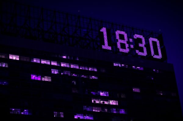
Color Corrected
Neutral, balanced, and true to life.
Color Graded
Stylized, warm, and highly cinematic.
2. The Psychology of Color
Before moving sliders, you must decide what you want the viewer to feel. Colors are deeply tied to human psychology:
- Warm Tones (Reds, Oranges, Yellows): Evoke feelings of comfort, energy, passion, or a nostalgic summer evening.
- Cool Tones (Blues, Cyans, Greens): Evoke feelings of isolation, melancholy, futuristic dystopias, or sterile environments.
The Famous “Teal & Orange” Look
If you analyze modern blockbuster films, you will notice a recurring color palette: Teal shadows and Orange highlights. Why is this so popular?
It comes down to color theory and the Color Wheel. Teal (blue-green) and Orange are complementary colors, meaning they sit on opposite sides of the wheel. Placing them together creates the highest possible visual contrast. Because human skin tones naturally fall into the orange/warm spectrum, cooling down the shadows with teal makes the subject pop out of the background effortlessly.
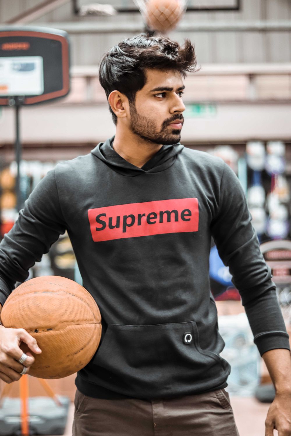
Notice how the cool background sharply contrasts with the warm skin tones of the subject.
3. The Essential Grading Tools
Whether you are editing in Adobe Lightroom, Photoshop, or DaVinci Resolve, you will rely on three primary instruments to craft your colors:
1. Tone Curves (The Backbone)
The Tone Curve is arguably the most powerful tool in editing. It allows you to adjust the brightness and contrast of specific tonal ranges (Shadows, Midtones, Highlights). By editing the individual Red, Green, and Blue (RGB) curves, you can meticulously inject specific colors into the darkest or brightest parts of your image.
2. The HSL Panel (Surgical Precision)
HSL stands for Hue, Saturation, and Luminance. This panel gives you surgical control over individual colors without affecting the rest of the image:
- Hue: Changes the actual shade (e.g., turning green grass into autumn yellow).
- Saturation: Controls the intensity or purity of the color.
- Luminance: Adjusts the brightness of that specific color.
3. Color Grading Wheels (Split Toning)
Color wheels allow you to quickly apply a color tint to specific brightness zones. For example, you can drag the shadow wheel towards blue to cool down the dark areas, and drag the highlight wheel towards orange to warm up the bright areas, instantly achieving a cinematic split-tone effect.
Master Your Visual Style
Theory is only the beginning. The best way to understand color grading is to train your eyes through active practice and experimentation.
Launch Edit Master Challenge